Free satellite data: a guide to monitoring disasters and environment
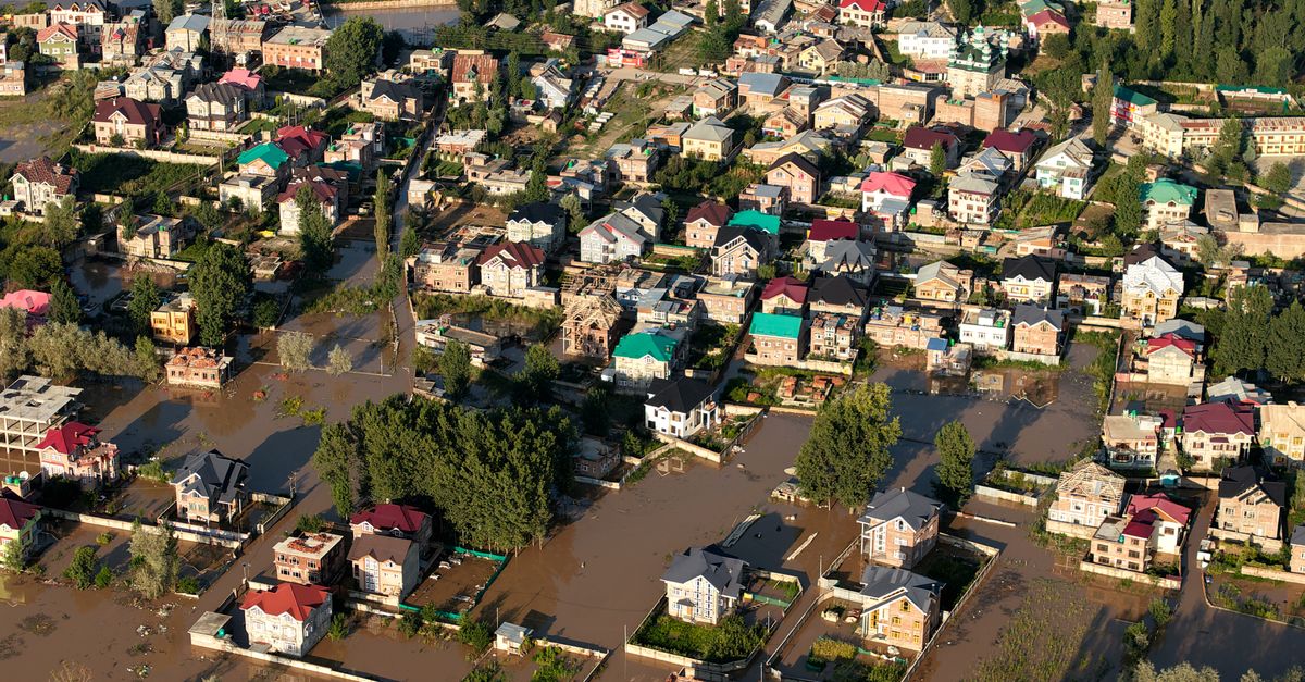
- Free satellite data from NASA, ESA, and ISRO can be used to track floods, fires, and deforestation.
- Platforms like Sentinel Hub and Google Earth Engine provide user-friendly access to satellite imagery.
- Practical steps include selecting data, processing images, and using indices like NDVI for vegetation health.
Open skies, open data
When a cyclone barrels toward the eastern coast, or a forest fire chars the hills of Uttarakhand, the first pictures to emerge are often not from a camera on the ground, but from a satellite orbiting hundreds of kilometres above. For decades, such imagery was the preserve of governments and well-funded research labs. That has changed.
Today, a vast repository of free satellite data is available to anyone with an internet connection. The catch is knowing how to use it. A new guide by Down To Earth walks through the practical steps of turning raw satellite feeds into actionable information about natural disasters and environmental change.
Where the data lives
The primary sources are the major space agencies. NASA's Earth Observing System, the European Space Agency's Copernicus programme with its Sentinel satellites, and ISRO's own Bhuvan portal all offer open access to their archives. The data comes in various resolutions, from coarse 250-metre pixels to sharp sub-metre captures, depending on the satellite and the sensor.
For most monitoring tasks, the medium-resolution Sentinel-2 and Landsat missions are the workhorses. They revisit the same spot every few days, which lets researchers track changes over time. The key is not just a single image, but a time series that reveals the before, during, and after of an event.
From pixels to pictures
Raw satellite data is not a pretty photograph. It is a bundle of numbers, often in different spectral bands, that need to be processed. This is where free platforms come in. Google Earth Engine allows users to run complex analyses on the cloud without downloading massive files. Sentinel Hub offers a simpler, browser-based interface for visualising imagery.
The guide recommends starting with false-colour composites, where near-infrared bands are used to highlight vegetation and water. A common technique is the Normalised Difference Vegetation Index, or NDVI, which measures plant health. During a drought, NDVI values drop; after a flood, they recover, but with a lag that can be mapped.
Tracking disasters in real time
For rapid-onset events like floods, the key is to compare a pre-event image with one captured during or after the event. The difference in water extents can be calculated using a simple threshold on the water-sensitive bands. This has been done for the Brahmaputra's annual floods, for cyclones in the Bay of Bengal, and for flash floods in the Himalayas.
Forest fires are another target. Thermal bands can detect active fires, while burnt-area products from MODIS or Sentinel-3 give a longer-term picture. The guide notes that these tools have been used by Indian researchers to map fire scars in the Western Ghats and to monitor crop residue burning in Punjab and Haryana.
Tools for the non-expert
Not everyone needs to write code. The Copernicus Emergency Management Service provides pre-processed maps of floods and fires, often within hours of activation. Similarly, NASA's FIRMS (Fire Information for Resource Management System) gives near-real-time fire alerts. For Indian users, the Bhuvan portal hosts thematic layers on land use, water bodies, and disaster risk zones.
The guide stresses that accuracy depends on ground truth. Satellite data is powerful, but it must be validated with field observations or local knowledge. A flooded pixel might be a waterlogged field or a new pond, and only an on-ground check can confirm.
What to watch next
As more satellites launch, including ISRO's NISAR mission in partnership with NASA, the frequency and resolution of free data will only improve. The challenge will shift from access to interpretation. For environmental journalists, students, and citizen scientists, the skills outlined in the guide are becoming as essential as a notepad and a camera. The next monsoon will bring its usual share of floods; the next summer its fires. With free data and a little practice, anyone can now watch them unfold from above.